How to create a clickable title similar to the Meetup app in Xamarin.Forms
Do you know the Meetup app? Meetup is a social network designed to facilitate offline group meetings. Why am I talking about it? Just to introduce the subject. What I want to talk about today is how to create a clickable title like the Meetup app for iOS in an app developed with Xamarin.Forms.
One of the things that caught my attention in this app is the home screen, which displays the name of the configured city and an arrow icon next to it. In reality, these two elements form a button that allows you to click and go to another screen, where you can reset the selected city.

I found this approach quite clever and intelligent since, in general, we don’t have much screen space to fill with buttons, and it’s not very pleasing to the user. So, the more we optimize the available space, the better.
This made me think: how can we achieve the Meetup app’s title behavior in a Xamarin.Forms application? It wasn’t difficult, and I managed to implement it for iOS. I’ll also implement it for Android in the future and update this post, alright?
Shall we proceed?
To start, I created a ContentPage for the home page and specified the two configurable attributes for text and icon. Without the custom renderer, you won’t see both the text and the image side by side; only one of them will appear.
<?xml version="1.0" encoding="utf-8"?>
<ContentPage
    xmlns="http://xamarin.com/schemas/2014/forms"
    xmlns:x="http://schemas.microsoft.com/winfx/2009/xaml"
    x:Class="Core.Views.HomeView"
    Title="Blumenau"
    Icon="arrow_down.png"
>
    <ContentPage.Content>
        <Label
            Text="Home"
            VerticalOptions="Center"
            HorizontalOptions="Center"
        />
    </ContentPage.Content>
</ContentPage>
Now, to start the customizations, I began implementing the custom renderer.
My initial attempt was to create a renderer for the NavigationRenderer, but it didn’t work. After some research, I found a similar implementation that used the PageRenderer.
Thus, I created a custom renderer for the PageRenderer, overriding the WillMoveToParentViewController method.
using Core.iOS.Renderers;
using UIKit;
using Xamarin.Forms;
using Xamarin.Forms.Platform.iOS;

[assembly: ExportRenderer(typeof(ContentPage), typeof(CustomContentPageRenderer))]
namespace Core.iOS.Renderers
{
    public class CustomContentPageRenderer : PageRenderer
    {
        public override void WillMoveToParentViewController(UIViewController parent)
        {
            base.WillMoveToParentViewController(parent);
        }
    }
}
With this, we can start modifying the renderer of our Xamarin.Forms ContentPage. So, let’s code in this method…
In this renderer, the logic is as follows: Load the instance of the ContentPage created in XAML; Read its Title and Icon attributes; Create a new visual component that will be a button containing the configured title and icon. Finally, update the NavigationPage title with the newly created element. Simple as that!
To load the instance of the ContentPage, we’ll use the Element attribute, which is defined in the PageRenderer class. Through it, we can access the Title and Icon properties defined in the XAML.
if (Element == null)
    return;

var page = Element as ContentPage;
Now, let’s create a button using UIButton, add the title and icon located in the ContentPage, and set the text color. We’ll also add this new object to be rendered in place of the default render, using the reference of the UIViewController to access the NavigationItem.
UIButton buttonTitle = new UIButton(UIButtonType.Custom);
buttonTitle.SetTitle(page.Title, UIControlState.Normal);
buttonTitle.SetTitleColor(UIColor.Black, UIControlState.Normal);
buttonTitle.SetImage(new UIImage(page.Icon), UIControlState.Normal);

parent.NavigationItem.TitleView = buttonTitle;
Let’s see how it looks:
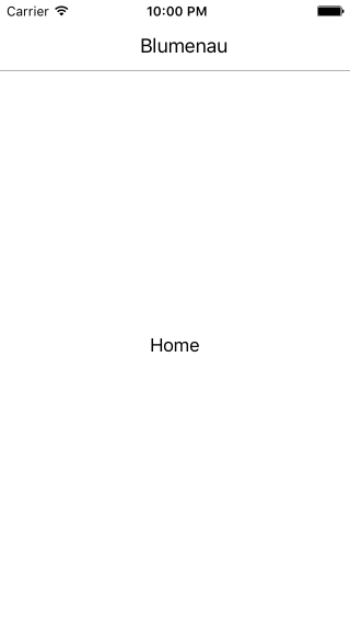
Oops, something seems wrong; the icon didn’t appear. But it’s not wrong; we just forgot to call the method responsible for arranging the content on the screen. So, let’s call SizeToFit on the button:
UIButton buttonTitle = new UIButton(UIButtonType.Custom);
buttonTitle.SetTitle(page.Title, UIControlState.Normal);
buttonTitle.SetTitleColor(UIColor.Black, UIControlState.Normal);
buttonTitle.SetImage(new UIImage(page.Icon), UIControlState.Normal);
buttonTitle.SizeToFit();

parent.NavigationItem.TitleView = buttonTitle;
Let’s check it out:
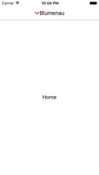
Much better! But the image is on the left, not the right. We can invert it. To do this, let’s specify the Transform attribute of the UIButton.
UIButton buttonTitle = new UIButton(UIButtonType.Custom);
buttonTitle.SetTitle(page.Title, UIControlState.Normal);
buttonTitle.SetTitleColor(UIColor.Black, UIControlState.Normal);
buttonTitle.SetImage(new UIImage(page.Icon), UIControlState.Normal);
buttonTitle.Transform = CGAffineTransform.MakeScale(-1.0f, 1.0f);
buttonTitle.SizeToFit();

parent.NavigationItem.TitleView = buttonTitle;
Look how it turns out:

Hey, am I reading Arabic?? No, we just inverted the button’s position. It’s like flipping it horizontally by 180 degrees. So how do we fix this? We can apply the Transform property to both the title and the icon, and then we’ll get the expected result. Note that for this icon, you don’t even need to apply the property, but if you have an image that doesn’t have equal sides, in that case, you’ll need to apply it.
UIButton buttonTitle = new UIButton(UIButtonType.Custom);
buttonTitle.SetTitle(page.Title, UIControlState.Normal);
buttonTitle.SetTitleColor(UIColor.Black, UIControlState.Normal);
buttonTitle.SetImage(new UIImage(page.Icon), UIControlState.Normal);
buttonTitle.Transform = CGAffineTransform.MakeScale(-1.0f, 1.0f);
buttonTitle.TitleLabel.Transform = CGAffineTransform.MakeScale(-1.0f, 1.0f);
buttonTitle.ImageView.Transform = CGAffineTransform.MakeScale(-1.0f, 1.0f);
buttonTitle.SizeToFit();

parent.NavigationItem.TitleView = buttonTitle;
See how it looks now:
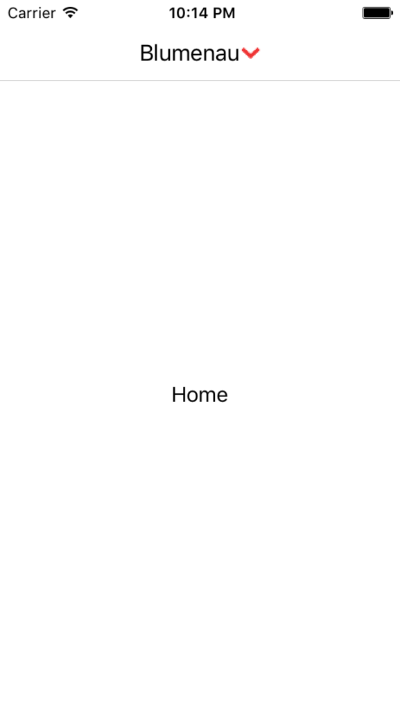
Much better! It’s more similar now, but there are still some things missing. Note that the title and icon are very close together. We can apply a little “hack” by adding some spaces at the end of the title, or we can use the ImageEdgeInsets property to adjust the spacing, which is more recommended:
UIButton buttonTitle = new UIButton(UIButtonType.Custom);
buttonTitle.SetTitle(page.Title, UIControlState.Normal);
buttonTitle.SetTitleColor(UIColor.Black, UIControlState.Normal);
buttonTitle.SetImage(new UIImage(page.Icon), UIControlState.Normal);
buttonTitle.Transform = CGAffineTransform.MakeScale(-1.0f, 1.0f);
buttonTitle.TitleLabel.Transform = CGAffineTransform.MakeScale(-1.0f, 1.0f);
buttonTitle.ImageView.Transform = CGAffineTransform.MakeScale(-1.0f, 1.0f);
buttonTitle.ImageEdgeInsets = new UIEdgeInsets(0, -20, 0, 0);
buttonTitle.SizeToFit();

parent.NavigationItem.TitleView = buttonTitle;
Let’s check it out:
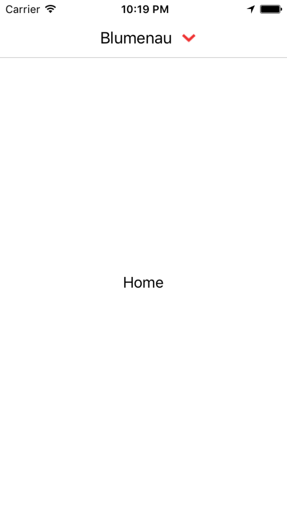
We’re almost there! What’s missing? A few finishing touches… If you check the Meetup app, there are two more characteristics in that title. One is that the title appears in bold, and the other is that when we click on it, it turns gray. We can easily achieve this by adjusting the font and setting the color to gray when the button’s state is highlighted.
UIButton buttonTitle = new UIButton(UIButtonType.Custom);
buttonTitle.SetTitle(page.Title, UIControlState.Normal);
buttonTitle.SetTitleColor(UIColor.Black, UIControlState.Normal);
buttonTitle.SetImage(new UIImage(page.Icon), UIControlState.Normal);
buttonTitle.Transform = CGAffineTransform.MakeScale(-1.0f, 1.0f);
buttonTitle.TitleLabel.Transform = CGAffineTransform.MakeScale(-1.0f, 1.0f);
buttonTitle.ImageView.Transform = CGAffineTransform.MakeScale(-1.0f, 1.0f);
buttonTitle.ImageEdgeInsets = new UIEdgeInsets(0, -20, 0, 0);
buttonTitle.SetTitleColor(UIColor.Gray, UIControlState.Highlighted);
buttonTitle.TitleLabel.Font = UIFont.BoldSystemFontOfSize(14);
buttonTitle.SizeToFit();

parent.NavigationItem.TitleView = buttonTitle;
Let’s see the result:
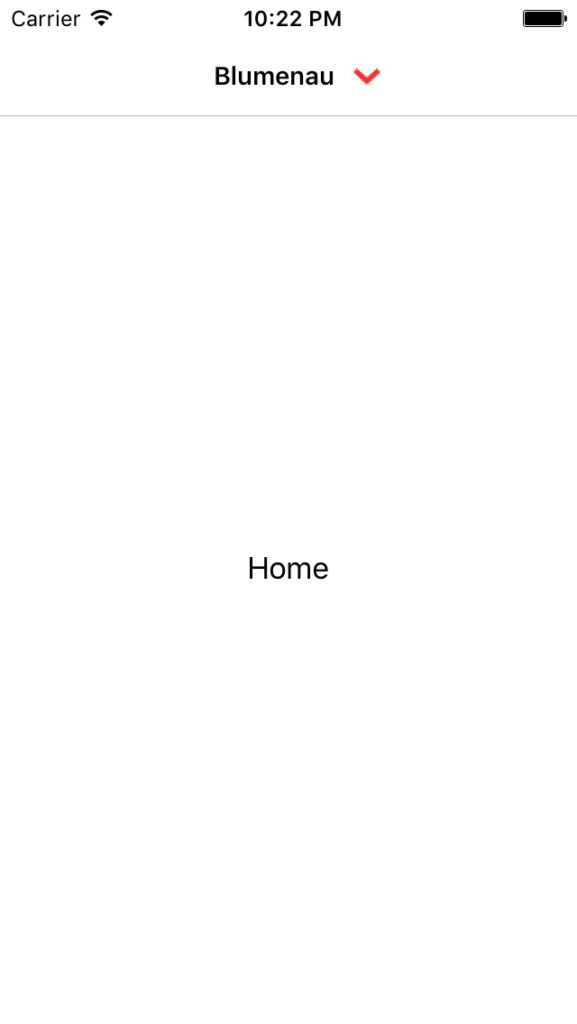
There you go! It worked!
And now, what’s left? One important feature, in my opinion: this button needs to be clickable so we can direct the app to another page. To achieve this, we can implement the TouchUpInside event of the UIButton.
However, things are starting to get a bit more complicated now. Think about it: until now, we used the title and icon, attributes that already exist in the ContentPage. However, there’s no attribute in it where we can link an action or event to perform an operation.
I think it would be best to extend the ContentPage and implement a command so that we can perform the operation in the custom renderer. Then, when we click on the button, we capture the event in TouchUpInside and call the command set in our ContentPage. Shall we try it?
First, let’s extend the ContentPage; I created a class called CustomContentPage. In it, I implemented a bindable property called Command.
using System.Windows.Input;
using Xamarin.Forms;

namespace Core.Controls
{
    public class CustomContentPage : ContentPage
    {
        public static readonly BindableProperty CommandProperty =
            BindableProperty.Create(
            nameof(Command),
            typeof(ICommand),
            typeof(CustomContentPage),
            null
        );

        public ICommand Command
        {
            get { return (ICommand)GetValue(CommandProperty); }
            set { SetValue(CommandProperty, value); }
        }
    }
}
In the page’s code-behind, I needed to change the inheritance from ContentPage to the new page we created. You’ll also have to do this.
using Core.Controls;
using Core.ViewModels;

namespace Core.Views
{
    public partial class HomeView : CustomContentPage
    {
        public HomeView()
        {
            InitializeComponent();
            BindingContext = new HomeViewModel();
        }
    }
}
The XAML also needed changes since the page now inherits from CustomContentPage, so we need to change that reference there as well. Notice that we also had to declare the namespace where the page I created is located.
<?xml version="1.0" encoding="utf-8"?>
<controls:CustomContentPage
    xmlns="http://xamarin.com/schemas/2014/forms"
    xmlns:x="http://schemas.microsoft.com/winfx/2009/xaml"
    xmlns:controls="clr-namespace:Core.Controls"
    x:Class="Core.Views.HomeView"
    Title="Blumenau"
    Icon="arrow_down.png"
>
    <ContentPage.Content>
        <Label
            Text="Home"
            VerticalOptions="Center"
            HorizontalOptions="Center"
        />
    </ContentPage.Content>
</controls:CustomContentPage>
Now, we can add a command to the Command property of the CustomContentPage.
<?xml version="1.0" encoding="utf-8"?>
<controls:CustomContentPage
    xmlns="http://xamarin.com/schemas/2014/forms"
    xmlns:x="http://schemas.microsoft.com/winfx/2009/xaml"
    xmlns:controls="clr-namespace:Core.Controls"
    x:Class="Core.Views.HomeView"
    Title="Blumenau"
    Icon="arrow_down.png"
    Command="{Binding OpenOptionCommand}"
>
    <ContentPage.Content>
        <Label
            Text="Home"
            VerticalOptions="Center"
            HorizontalOptions="Center"
        />
    </ContentPage.Content>
</controls:CustomContentPage>
OMG! This is getting crazy! Don’t worry; it gets worse. Now let’s go back to our custom renderer and make some customizations.
First, we’ll change the ExportRenderer declaration to connect it with CustomContentPage, not ContentPage.
[assembly: ExportRenderer(typeof(CustomContentPage), typeof(CustomContentPageRenderer))]
namespace Core.iOS.Renderers
{
    public class CustomContentPageRenderer : PageRenderer
    {
        ...
    }
}
Then, let’s customize the WillMoveToParentViewController implementation, casting the Element to the CustomContentPage class and implementing the TouchUpInside event.
public override void WillMoveToParentViewController(UIViewController parent)
{
    base.WillMoveToParentViewController(parent);

    if (Element == null)
        return;

    var page = Element as CustomContentPage;

    UIButton buttonTitle = new UIButton(UIButtonType.Custom);
    buttonTitle.SetTitle(page.Title, UIControlState.Normal);
    buttonTitle.SetImage(new UIImage(page.Icon), UIControlState.Normal);
    buttonTitle.SetTitleColor(UIColor.Black, UIControlState.Normal);
    buttonTitle.Transform = CGAffineTransform.MakeScale(-1.0f, 1.0f);
    buttonTitle.TitleLabel.Transform = CGAffineTransform.MakeScale(-1.0f, 1.0f);
    buttonTitle.ImageView.Transform = CGAffineTransform.MakeScale(-1.0f, 1.0f);
    buttonTitle.ImageEdgeInsets = new UIEdgeInsets(0, -20, 0, 0);
    buttonTitle.SetTitleColor(UIColor.Gray, UIControlState.Highlighted);
    buttonTitle.TitleLabel.Font = UIFont.BoldSystemFontOfSize(14);
    buttonTitle.SizeToFit();
    buttonTitle.TouchUpInside += (sender, e) =>
    {
        if (page.Command == null)
            return;

        if (page.Command.CanExecute(null))
            page.Command.Execute(null);
    };

    parent.NavigationItem.TitleView = buttonTitle;
}
Done! And what’s the result of this?
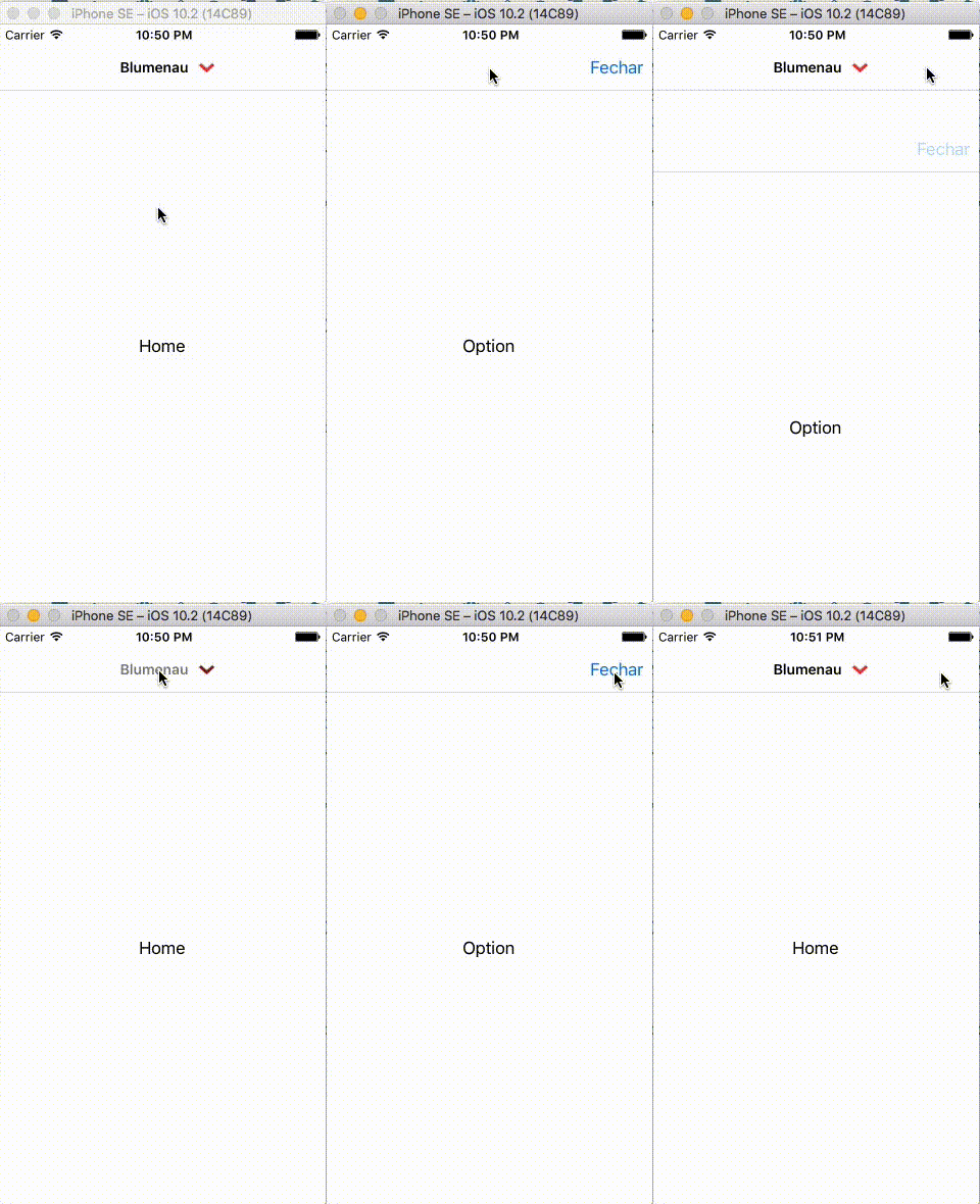
Look at that… It actually worked!!
This post became very long; maybe it’s better to publish the Android customizations in a new post. I haven’t implemented it yet; it might take a while. As soon as I have updates, I’ll let you know.
The sample code used in the post is on GitHub.
Hugs! I look forward to your feedback. Critiques and suggestions are always welcome (and money in my account too, just kidding haha).