Xamarin.Forms – Fixing ImageCell rendering on Android
When using TableView in Xamarin Forms, we have some options for elements, such as TextCell, ImageCell, SwitchCell, EntryCell. These elements are referred to as built-in cells. In this article, we’ll talk a bit about ImageCell.
With ImageCell, we can easily add an image and texts. Let’s see a simple usage:
{% highlight xml %}
The Problem
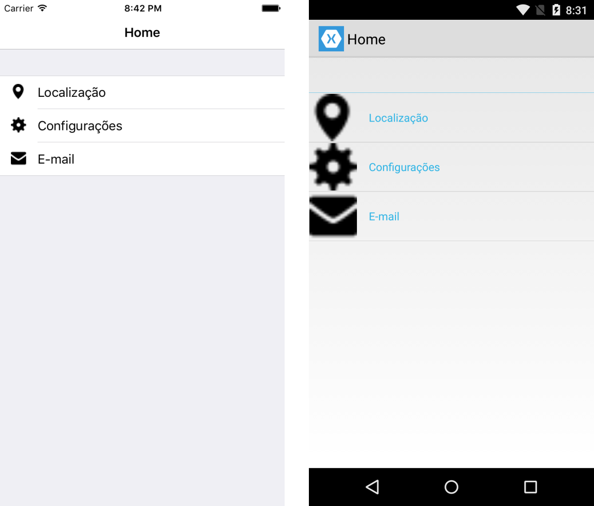
There are some differences in rendering this component between Android and iOS platforms. On Android, when we use a very small image in ImageCell, it gets stretched and occupies the entire image container, which is 60x60 pixels, as shown below:

The Solution
Fortunately, we have two solutions to fix this problem. Let’s explore them.
For the examples shown, we have added a page containing a TableView with three options, each containing an image and a descriptive text.
Solution 1 – Customizing the ViewCell
One of the easiest ways is not to use ImageCell and customize the cell to be rendered, thus having flexibility to manipulate each added element.
{% highlight xml %}
  <ViewCell>
    <StackLayout Padding="15, 5, 15, 5" Orientation="Horizontal">
      <Image Source="settings.png" />
      <Label Text="Settings" VerticalOptions="Center" />
    </StackLayout>
  </ViewCell>

  <ViewCell>
    <StackLayout Padding="15, 5, 15, 5" Orientation="Horizontal">
      <Image Source="email.png" />
      <Label Text="E-mail" VerticalOptions="Center" />
    </StackLayout>
  </ViewCell>
</TableSection>
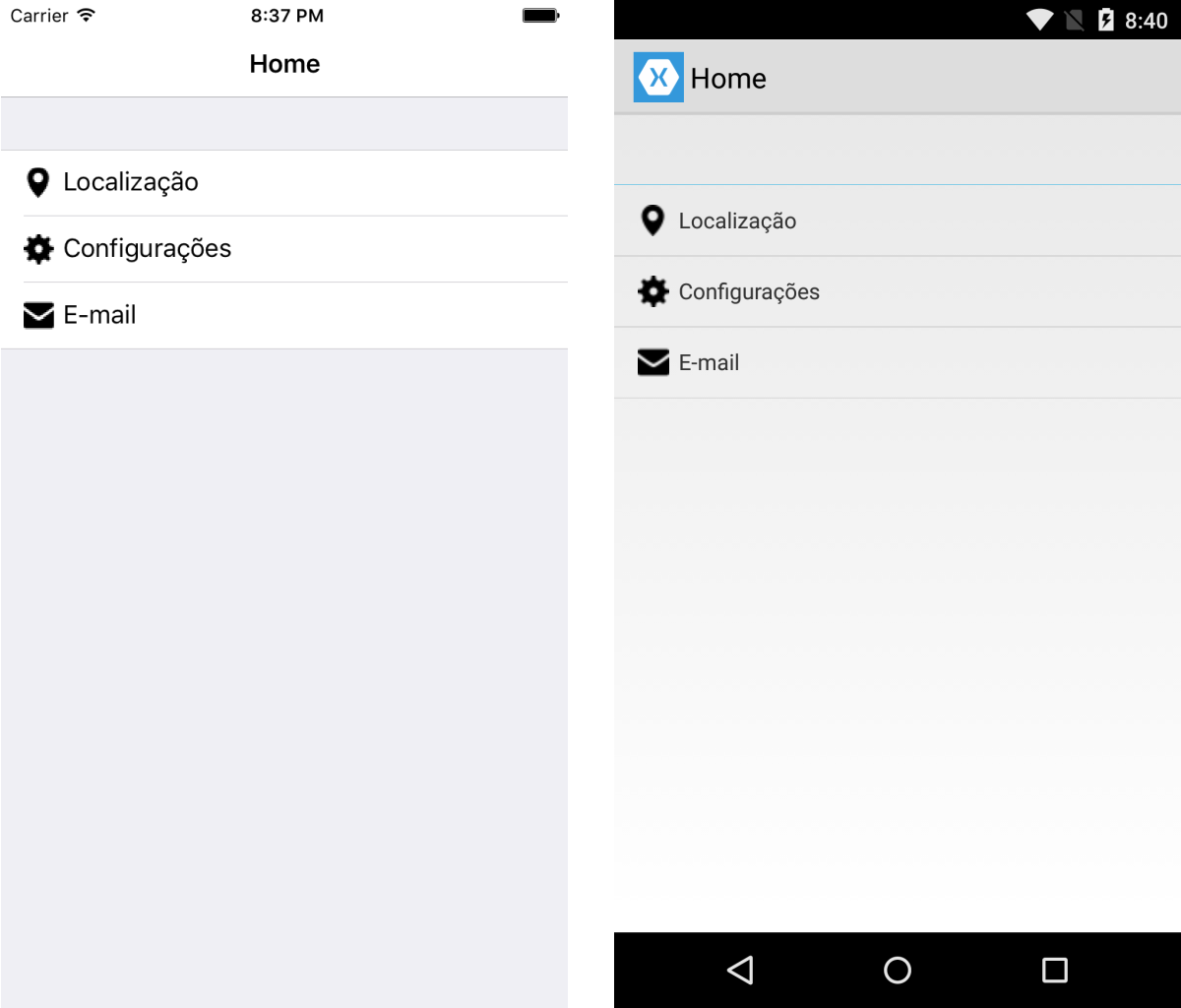
This way, we obtain a satisfactory result, as shown below:

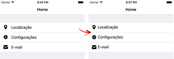
It worked for Android, but I believe this solution is still not ideal. If we pay attention, we’ll notice a small difference in the iOS rendering. Let’s analyze the rendering of the default ImageCell and the newly created custom ViewCell.
Notice that in the left image (rendered with ImageCell), the line that delimits the cells starts from the text, while in the right image (rendered with custom ViewCell), this line starts together with the image.

This may seem like a simple detail, but in my opinion, it is a clear indication that we are not using the standard proposed by the platform. Moreover, in large lists, we may have performance issues with the rendering of these customized cells. If you check the documentation, Xamarin suggests always using built-in cells, such as ImageCell, TextCell, etc.
So, what to do? Let’s explore Solution 2 to find out.
Solution 2 – Implementing ImageCellRenderer on Android
We’ll have a little more work for this implementation, but we’ll ensure better behavior on both platforms.
First, let’s create our own custom control for ImageCell:
{% highlight cs %} using System; using Xamarin.Forms;
namespace Core.Controls { public class CustomImageCell : ImageCell { } } {% endhighlight %}
Next, let’s update the XAML to reference the newly created custom control:
{% highlight xml %}
Now, let’s customize the appearance of our custom control on the Android platform.
{% highlight cs %} using System; using Xamarin.Forms.Platform.Android; using Xamarin.Forms; using Core.Droid.Renders; using Core.Controls; using Android.Widget;
[assembly: ExportRenderer (typeof (CustomImageCell), typeof (CustomImageCellRenderer))] namespace Core.Droid.Renders { public class CustomImageCellRenderer : ImageCellRenderer { protected override Android.Views.View GetCellCore (Cell item, Android.Views.View convertView, Android.Views.ViewGroup parent, Android.Content.Context context) { LinearLayout cell = (LinearLayout)base.GetCellCore (item, convertView, parent, context); ImageView image = (ImageView)cell.GetChildAt (0); image.SetScaleType (ImageView.ScaleType.Center); return cell; } } } {% endhighlight %}
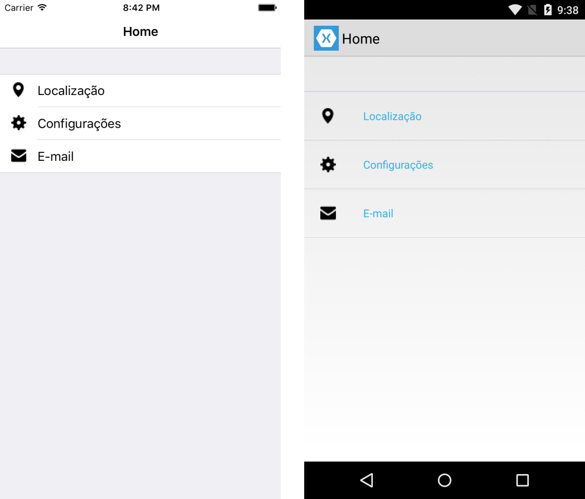
The most important part here is the configuration we are applying to the image, where we set the ScaleType to Center. With this, we achieve a more appropriate rendering on Android:

Note that we did not customize the appearance on iOS; we only specified the appearance on Android, so the default ImageCell rendering, which was already appropriate, remains on iOS.
There you have it! What do you think? Feel free to leave your comments, whether criticism or suggestions.
You can also download the project and test each scenario described in the post. The repository is on GitHub.
That’s all for today, cheers!